A New Angle on Making Effective Art

Do you want to know a neat way to influence the minds of your audience? Do you want to create art that affects the people looking at so that it makes them happy, or feel sad, or awestruck. Of course there are many ways to affect the psychology of your viewers, but one particularly subtle method and the subject of my article today is the view angle.

What is the View Angle?

The view angle goes by a few names. In photography and cinematography, it is generally called “camera angle”. It drawing and painting, you might hear it as the “point-of-view”, “perspective”, or “horizon line”. Basically, it defines how the viewer looks into the scene. Are they looking down at the subject, up at it, or level with it? Of course for purely abstract work, this doesn’t apply, but for most scenes you can use this to indicate the emotion that the viewer should experience when seeing it.
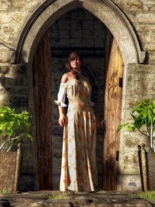
High Angle

The Leaving
“The Leaving”
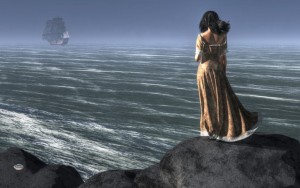
In this image, I used a high angle to give the woman a sense of sadness as the ship sails away. The horizon being high in the composition also increases the sense of distance between the woman and the ship.
For a high angle scene, the viewer is looking down upon the subject. It may only be a subtle downward tilt, but it could be looking almost straight down at something. In the composition, the horizon line (or perceived horizon) is more than half way up the picture and, in fact, can be off above the top of the frame. The front sides of objects in the scene tend to have curves and angles that point or motion downwards.

The psychological effect of this point of view is generally one that elicits darker feelings in the viewer: depression, sadness, loss. Because this angle indicates that the viewer is above the subject, it also gives them a slight sense of superiority even possibly allowing you to elicit sympathy from your audience. For instance, images depicting the death of a hero, innocent, victim, or any other type of character that the audience should like tend to use this angle of view.

The high angle of view can also increase the sense of time in a scene. In outdoor scenes, the eye has to travel further from the bottom to reach the horizon. In other words, the sense of distance in a scene is increased. Also, viewers tend to perceive objects intended to be in motion as heavier and moving more slowly.
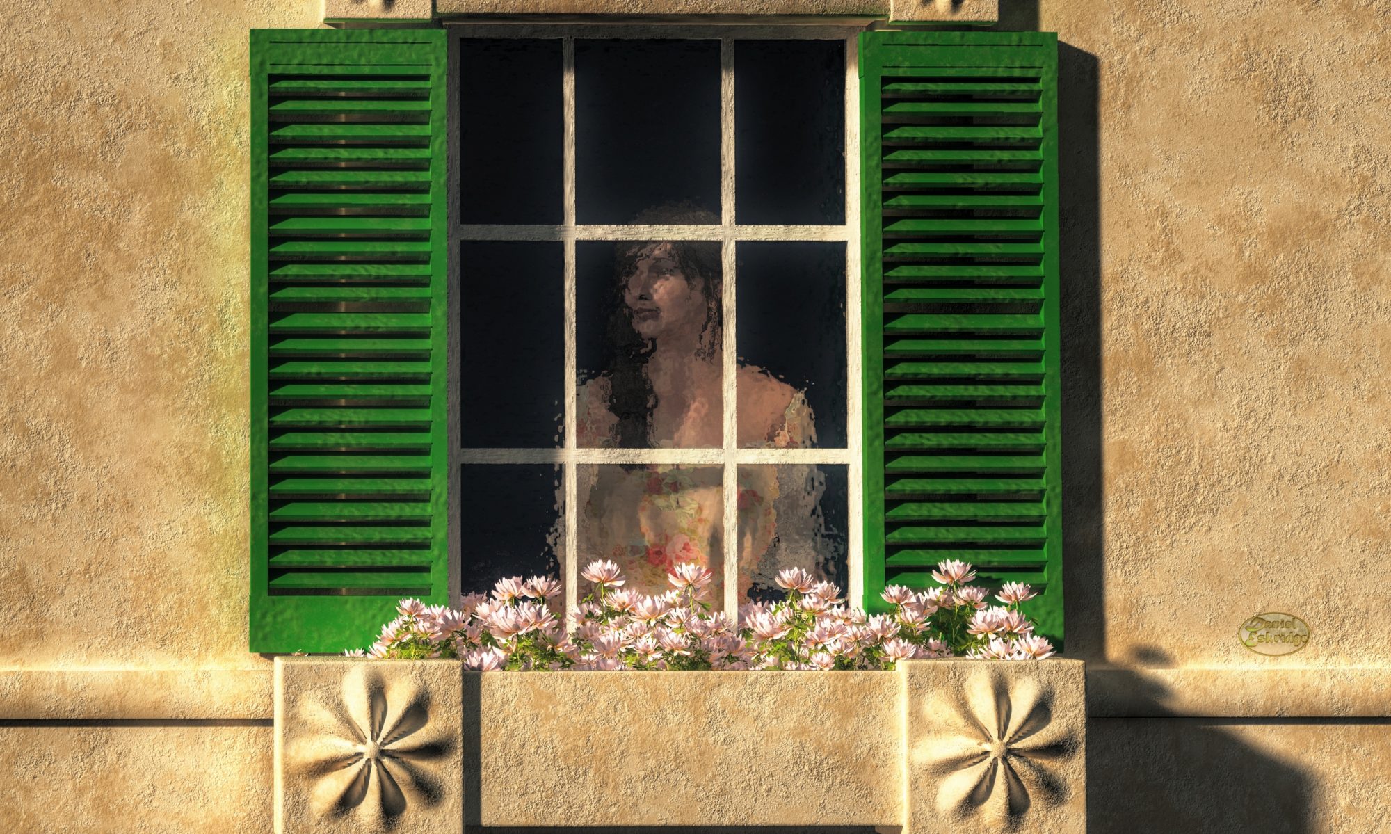
Low Angle

Justice
“Blind Justice With Scales And Sword”
In this image, I wanted to make Themis, the embodyment of justice, seem heroic. So I depicted her from a low angle.
The low angle scene is one where the viewer is looking more up at a subject and gives the opposite effect from the high angle point of view. With respect to the compositiuon, the horizon is below the halfway point in the image. The front edges of object have angles and curves that motion towards the top of the composition.

Low angle scenes tend to be happier in theme. In outdoor scenes, the sky dominates and introduces a great deal more light into the image. As the angle increases, subjects can start to give off a heroic sense even awe. The viewer tends to be inferior to the subject. This psychological effect is one of the reasons why kings and rulers sat on elevated platforms throughout history. Taken to the extreme though, you can give your viewers a sense of fear as a subject looms over theme.

Also, from this point of view, objects meant to be in motion tend to appear to be moving faster, and they might be perceived to be lighter in weight.

The Dutch Angle

The Dutch Angle, or the dutch tilt, is a more unique angle. It is accomplished by tilting the scene. In the real world, we don’t tend to experience it as our brain compensates for any tilt of the head, but in art, you notice it because the tilt conflicts with the level lines of the top and bottom of the frame. In a way, the Dutch angle sort of combines both the low and high angle. The horizon now travels diagonally across the scene. The effect on the viewer is to instill a sense of unease and unbalance. This is a favorite of horror scenes, but can also be used to make an action scene feel more chaotic.

You should be careful of using the Dutch angle too much. Viewers sometimes catch it as an attempt to manipulate them, and that destroys the intended effect. For instance, I’ve seen lots of movie reviews poking fun of director Michael Bay for overusing it in his action movies. Instead of instilling a sense of unease, the it creates unintentional comedy.


Being aware of and using the view angle in your art is definitely something you should look into as an artist. However, keep in mind that the contribution of view angle to an artwork is generally not that extreme. Its effect is subtle, and it is something probably better used in combination with other visual cues to influence your audience, such as framing and lighting. However, I find it to be another useful tool to consider when putting a scene together.

Regards,
Daniel

P.S. If you liked this article, please consider signing up for my newsletter. I send it out every Wednesday and it includes links to my latest artworks, articles, and videos, as well as discounts, deals, and freebies!

The KEY to Telling a Story With Art

Okay, so the title is a bit of a pun. Obviously, there are many aspects of a scene that tell a story, but the one that I’m going to talk about today is lighting, specifically, the lighting styles known as “Low Key” and “High Key” and how they influence the mood of a scene. These two types of lighting generally involve the two most important lights in your scene, so we’ll talk about those first.

Key and Fill Lights

Vermeer loved to use the light from a window as the key light.
(Note: This image links to Amazon)

The Key Light

The most important light in your scene is most often your key light. The key light is the light that defines the forms in the scene. It strikes the subjects of a scene from an angle and defines the edges of your picture’s elements. In outdoor settings, the sun usually acts as the key light. On a stage, it’s the main spotlight on the actors. In an interior it might be the light from a window or just a lamp positioned to define the edges of forms.

The fill light

The fill light is a light that is used to control the level of the shadows in a scene. It generally comes from somewhere around the front of the scene and points back or up into it. It might seem to come from where the viewer is standing, the floor in front of a subject, or perpendicular in the scene to the key light. Generally it is less bright than the key light and softer. In an outdoor scene, the fill light may actually still be sunlight, only rather than direct sunlight, it is the sunlight reflected off the ground or other elements of the scene.

Other Lights

There are of course other possible light sources in a scene, such as back/rim lights and kickers, but they play less of a role in the determining high vs low key. I thought I should mention them though so you don’t get the idea that you only ever have two light sources in a scene.

Low Key Lighting

Woman Facing a Skull

In low key lighting, the fill light is generally turned down very low. This creates deep shadows in the scene. The emotional effect is one of drama. Low key lighting tends to be used for scenes in mysteries, thrillers, horrors or tragedies.

In the image “Woman Facing A Skull”, I’ve used low key lighting. Even though she has a neutral expression, there is still a sense of foreboding or even sadness. The skull seems to have an effect on her. The depth of the shadows in such a scene gives the viewer a subconscious sense of the depth of the emotions involved as well.

High Key Lighting

Woman Examining a Skull

High Key lighting is lighting where the key light and fill light are roughly evenly bright. In this style, the scene has shadows that are not very dark or even barely exist. This is the kind of lighting you use to portray scenes that tend to be emotionally lighthearted. This is the kind of lighting for comedic, whimsical, or just plain happy scenes.

You can also use it for indicating a sense of clinical detachment. For instance, in the image “Woman Examining A Skull”, I’ve used high key lighting. It’s the same scene as “Woman Facing a Skull”, but now it looks like she is just casually examining the skull.

Wrap up

Now, obviously, there was more I could have done to differentiate the moods of the two images of the woman with a skull. The lighting style is only one element that you can control in a scene. To tell more of a story, you’d probably need to do more. For instance, I could have given her face more expression and changed the camera angles to considerably more effect, but I am trying to show how you can do quite a lot with just lighting.

Also keep in mind that high key and low key lighting are not absolutes. Rather, they represent two directions. In high key lighting the ratio of lighting tends to favor your key light, whereas low key lighting tends to be closer to 1:1, but there are no set number for those ratios. Rather you can determine the emotional depth of a scene moving in one direction or another.

Regards,
Daniel

P.S. If you liked this article, please consider signing up for my newsletter. I send it out every Wednesday and it includes links to my latest artworks, articles, and videos, as well as discounts, deals, and freebies!

Framing, How to Trap People in Your Art

Woman At A Medieval Door
“Woman At A Medieval Door”
In this work, I use the doorway to frame the figure of the woman.
One of my favorite techniques for making art that captures an audience is framing. Framing is arranging your composition so that the main subject is partially or completely surrounded by something else in the scene: a window, the walls of a canyon, columns, tree trunks (one of my favorites)…anything that creates a psychological border that prevents the viewer’s eyes from escaping the image or moving away from the focal point. For instance, a common way use this technique is to position a person in an open door. In such an example, the doorway frames the human figure.

Generally, the elements that are being used to frame the subject are in the foreground, closer than or even with the subject being framed. In other words, the viewer is looking through the frame at the subject. The formal name for such a setup is repoussoir. However, you can use elements in the background to frame a subject, too. For instance, you might align your subject with a break in the clouds behind it so that the clouds create a halo around that subject.

Another thing that makes framing really neat is that it can give you as the artist power over the viewer. Using this technique, you can position the viewer within the scene. You can put them inside a house looking out, on a path leading into a forest, or outside of a cave looking in. In this way, you make them part of the art. You can even influence the viewer’s emotions with this technique. For instance, you can make them feel fear by boxing them in an alley, have them experience guilt by spying through a keyhole, or oppress them by trapping them behind bars.

So the next time you creating an artwork. Keep framing in mind. It can be quite a powerful tool.

Regards,
Daniel

P.S. If you liked this article, please consider signing up for my newsletter. I send it out every Wednesday and it includes links to my latest artworks, articles, and videos, as well as discounts, deals, and freebies!

Re-texturing Poser Figures Using Zbrush – A Video Tutorial

Sometimes I don’t like the texture that comes with a Poser (or Daz Studio) figure. So I re-texture it using ZBrush. I thought that other 3D render artists might benefit from knowing how I do it, so I posted a tutorial on Youtube.

So…here’s the video:

Daniel

P.S.

Don’t forget to check out this week’s sponsor, Dick Blick Art Materials (since I offer this site for free, I have to fund it somehow 😉 )

www.dickblick.com

Painting a Snowstorm, a GIMP Tutorial

A couple of my artworks that have been rather successful have featured snowstorms. I had a few questions about how I did it. Being a 3D render artist, people seemed to think that I might be using some sort of particle simulator or something, but, no, I just do it using the open source image editor GIMP.

So…here’s the video:

Daniel

P.S.

Don’t forget to check out this week’s sponsor, Dick Blick Art Materials (since I offer this site for free, I have to fund it somehow 😉 )

www.dickblick.com

How to Make Art that Sells Better

Though any kind of artwork can sell, there are still things you can do when making art that will make yours more likely to get purchased. What are these mysterious “things”? Why, they are the fundamentals of art, of course.

The Fundamentals of Art

On first glance, the fundamentals of art look like just the elements that make up a particular piece of art, but the idea of fundamentals implies more than just knowing what they are, but how to use them in such a way as to make your art more likely to be well received by the people viewing it. In many cases, people won’t necessarily know why they like art that takes advantage of the fundamentals, they just do. They tend to operate on the subconscious level of the viewer.

This is not necessarily a complete list, but some of the most important ones. In the future, I will likely have more detailed articles involving these subjects.

Line

Velociraptor Chasing a Small Mammal
In this work, I use a curved virtual line (highlighted with the red line) formed by the animals’ bodies to give a sense of action and motion

Line is the most basic of the structural elements of artwork. Almost all visual artwork involves lines. Of course, they define the outlines of shapes and forms, but they can also be used by the artist to guide the viewer: Strong straight lines can give a sense of strife, stress, anger, and aggression. Soft curved lines can indicate sensuality, relaxation, calm. You can use harder curves to emphasize movement or energy. Moveover, you can also orient the lines so that they draw the viewer’s eye to a certain area or in a certain direction.

Lines can also be implied rather then explicitly defined. Think of a line of people. They are not literally a line drawn from one point to another, but a group of subjects arranged in such a way to indicate a line.

Shape

A shape is what you get when a line closes back on itself. Shapes are two dimensional (though for something like sculpture, they may be oriented in a 3D space). Much like lines, you can use shapes to affect the user. Triangular shapes can indicate direction or speed. Rectangular shapes can indicate stability, stillness, or solidity while circles and ovoids might represent instability or movement.

Also, shapes may be implied just like lines. Objects can be arranged to create a virtual shape, e.g. a circle stones.

Form

Form is the 3D cousin of shape. It can be important in 2D works as well as in sculptures. It can define the way the lights and shadows play out in the image. Hard forms will create dramatic contrasts in light and increasing the tension of a work where soft forms will create more gradual transitions from light to dark giving works more of a sense of gentleness or sensuality.

Composition

Elephant Stampede
Composition can be used to influence the viewer’s emotions. In this case, I have the elephants form the shape of an eye (highlighted in green) looking back at the viewer to heighten the sense of threat.

Composition is the arrangement of of the prior three fundamentals: line, shape, and form. Composition can get very complex. There are enough books on this subject alone to fill libraries. With proper composition you can guide the viewer’s eye through your scene, indicate to them what is important, even affect their emotions. The will be much more on Composition in future articles.

Value

Value is the balance of light and dark in an artwork. I’ve already mentioned the importance of having a full range of light and dark, but there is more to value that just that. You can shift the balance of value to affect the viewers mood and energy. Works heavy in darker values can indicate doom and gloom. Works on the lighter end, tend to be happy and bright. Values can be strong in both the dark and light ends avoiding the mid-tones to increase a sense of drama, while works with values heavy in the mid-tones can give a more casual feel.

Color

Color too can be used to influence your viewers. Of course, certain colors have their cultural associations: e.g. in Western culture, black is often the color of villainy, red the color of danger but also lust, green the color of peaceful nature, blue sadness, etc. However, color can also be used to draw the eye, such as using the only small splotch of red in otherwise cool colored image to create a focal point. Also, understanding color theory (how different colors work together) can help your art, too. For instance, art that is themed with complimentary colors (red/green, blue/orange, yellow/purple) tends to be better received.

Light

Light is the basis of human visual experience. For abstract work, it’s may not even be a factor, but for figurative work, it is possibly the most important of the fundamentals. The various ways of lighting a scene can immensely change the viewers experience. High key lighting gives a sense of lightheartedness, happiness, casualness. Whereas, low key lighting can give a sense of drama or danger. Strong back lighting can create a halo around a subject and is often used to indicate sensuality and love.

Texture

Texture is, of course, very important in the realm of sculpture. It’s the way something feels. However, it can, like lines and shapes, be implied visually. You can have texture in a 2D work by indicating to your viewer what a surface would feel like if they touched it, for instance, you might use a rough brush stroke to give a wooded structure a rustic feel.

Don’t underestimate this fundamental. One of the most popular selling items that I’ve seen are photographs that have been “textured” with the use of Photoshop filters.

______________________

There are other fundamentals as well. I just wanted to touch on the major ones. Understanding each of these and learning how to use them to your advantage will allow you to create works that have more of a psychological effect on your viewers. Used properly, they tend to give your work an air of professionalism, but moreover, viewers will just seem to like them more without knowing why. You don’t necessarily need to use all of the fundamentals in a given piece, and sometimes, they don’t even apply (like color in a B&W image), but even taking advantage of one or two can make your works more appealing to potential customers.

Regards,
Daniel
P.S.

Don’t forget to check out this week’s sponsor, BorrowLenses.com (since I offer this site for free, I have to fund it somehow 😉 )

Thanksgiving Special: 10% Off + 4 FREE Rental Days

Making Art That Has Value

I’ve said it before: you can make any kind of art and sell it. All you have to do is find the right people, people who like your art enough to buy it. Any piece of art you make has a chance of success. You can do everything wrong according to the fundamentals of art and, against the odds, still have a hit. However, if you want to play the odds, and, put them more in your favor that your art will be well received, then you need an understanding of the fundamentals of art.

Today, my subject is one of the those fundamentals: Value. I’m not talking about how much a work of art is worth. Rather, I am referring to value as the range of light and dark shades within it. It’s a mistake I see time and time again from artists whose works I look at: They don’t use a complete range of values: the lightest shade is not bright enough or the darkest not deep enough. The result is that potential buyers see such a work as drab, washed out, or just plain dull.

Polar Bear in a Snowstorm
This version of my “Ploar Bear in a Snowstorm” has a full range of values, even for a subject that involves a lot of white objects.
Polar Bear In A Snowstorm Dingy
A dingy version where there is not enough light values.
Polar Bear In A Snowstorm Washed Out
This version is washed out. It lacks dark values.

Buyers tend to react better to a full range of values. The darkest part of your artwork should be black and the lightest should be white. That is not to say your work should be dominated by large dark areas and large light areas. In fact, those end points may only take up a small amount of the total area of your work. The point is that your work has a complete range of values: it might be heavy in the dark values or light values, but it should not ever be completely lacking one or the other.

Since we’re talking about selling your art online, I know that you actually have an advantage in this area. In order to sell art online, you have to have digital images of your work. That means you can open such images in photo editing software, such as Photoshop or GIMP.

One thing you can do rather quickly to see the range of values in your work is to convert them to grey scale (assuming your work was not already a black and white image). Looking at a work without the color, makes the dark and light values easier to see. With photo editing software, removing the color can usually be done with a single click of a mouse.

Another thing you can do with such software is to look at the histogram of an image. This is a graph that actually shows you the distribution of value in your image. What’s more, you can usually adjust the value of your image using the histogram (though if you are selling originals, you should be careful not to adjust so much that the digital image no longer accurately represents the original).

Balanced Histogram
This is the histogram for the final version of the “Polar Bear in a Snowstorm” above
Dingy Historgram
This is the histogram for the dingy version of the “Polar Bear in a Snowstorm” above
Washed Out Histogram
This is the histogram for the washed out version of the “Polar Bear in a Snowstorm” above

So, in order to potentially increase the value OF your art, pay attention to the value IN your art.

Regards,
Daniel

P.S.

Don’t forget to check out this week’s sponsor, Dick Blick Art Materials (since I offer this site for free, I have to fund it somehow 😉 )

www.dickblick.com

There Is No Such Thing As “Good” (or “Bad”) Art

Abstract Expressionist works such as those of Jackson Pollock often spark debates as to what constitutes good and bad art.  They disregard almost all the fundamentals of art, yet still are admired by many and sell for millions.
Abstract Expressionist works such as those of Jackson Pollock often spark debates as to what constitutes good and bad art. They disregard almost all the fundamentals of art, yet still are admired by many and sell for millions.

My response to this question is that such terms as “good” and “bad” are not really applicable to art. First off, those are vague terms, and if you ask a hundred different people what makes are “good” you will get a hundred different answers. The only thing that really makes a piece of art good, is that people think it is.

There was a story earlier this year on NPR about the nature of popularity and what makes things (particularly art) good. It talked about why the Mona Lisa was considered the best painting in history. The answer but a bit cyclical in that it is considered the best simply because so many people consider it to be so. It’s good because people say it is.

That’s the beauty of art. It is completely subjective and can defy such categorization as being “good” or” bad”. It all depends on the person experiencing that art. It gets down to the old saying: “One man’s trash, is another man’s treasure.”

So, when it comes to selling art online, don’t be overly worried about whether your art is “good” or “bad” because the chances are, that, no matter what you put out there, some people will like it while others will not. The trick is to find those who do.

That’s where marketing comes in. Marketing is really the key to selling online. If you are good at marketing, you can sell just about anything. It’s all about finding the right buyer.

I’m going to add one caveat that though. Though I think such terms as “good” or “bad” aren’t appropriate when discussing art, there are some things you can do while making art that will increase the odds that more people will like your art. These are such concepts as composition, value, color, subjects, and many more such fundamentals much of which will be the basis for future articles.

Of course, you can create a work of art that ignores all the fundamentals and still have a hit, but the odds will favor those who take advantage them. So you can look forward to me discussing many of them in the future.

Daniel

P.S.

Don’t forget to check out this week’s sponsor, Dick Blick Art Materials (since I offer this site for free, I have to fund it somehow 😉 )

www.dickblick.com