Though any kind of artwork can sell, there are still things you can do when making art that will make yours more likely to get purchased. What are these mysterious “things”? Why, they are the fundamentals of art, of course.
The Fundamentals of Art
On first glance, the fundamentals of art look like just the elements that make up a particular piece of art, but the idea of fundamentals implies more than just knowing what they are, but how to use them in such a way as to make your art more likely to be well received by the people viewing it. In many cases, people won’t necessarily know why they like art that takes advantage of the fundamentals, they just do. They tend to operate on the subconscious level of the viewer.
This is not necessarily a complete list, but some of the most important ones. In the future, I will likely have more detailed articles involving these subjects.
Line
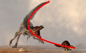
Line is the most basic of the structural elements of artwork. Almost all visual artwork involves lines. Of course, they define the outlines of shapes and forms, but they can also be used by the artist to guide the viewer: Strong straight lines can give a sense of strife, stress, anger, and aggression. Soft curved lines can indicate sensuality, relaxation, calm. You can use harder curves to emphasize movement or energy. Moveover, you can also orient the lines so that they draw the viewer’s eye to a certain area or in a certain direction.
Lines can also be implied rather then explicitly defined. Think of a line of people. They are not literally a line drawn from one point to another, but a group of subjects arranged in such a way to indicate a line.
Shape
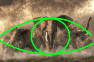
A shape is what you get when a line closes back on itself. Shapes are two dimensional (though for something like sculpture, they may be oriented in a 3D space). Much like lines, you can use shapes to affect the user. Triangular shapes can indicate direction or speed. Rectangular shapes can indicate stability, stillness, or solidity while circles and ovoids might represent instability or movement.
Also, shapes may be implied just like lines. Objects can be arranged to create a virtual shape, e.g. a circle stones.
Form
Form is the 3D cousin of shape. It can be important in 2D works as well as in sculptures. It can define the way the lights and shadows play out in the image. Hard forms will create dramatic contrasts in light and increasing the tension of a work where soft forms will create more gradual transitions from light to dark giving works more of a sense of gentleness or sensuality.
Composition
Composition is the arrangement of of the prior three fundamentals: line, shape, and form. Composition can get very complex. There are enough books on this subject alone to fill libraries. With proper composition you can guide the viewer’s eye through your scene, indicate to them what is important, even affect their emotions. The will be much more on Composition in future articles.
Value
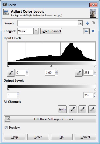
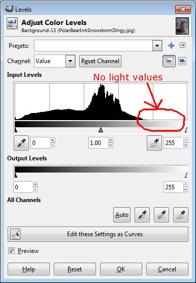
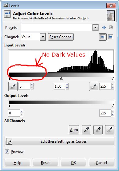
Value is the balance of light and dark in an artwork. I’ve already mentioned the importance of having a full range of light and dark, but there is more to value that just that. You can shift the balance of value to affect the viewers mood and energy. Works heavy in darker values can indicate doom and gloom. Works on the lighter end, tend to be happy and bright. Values can be strong in both the dark and light ends avoiding the mid-tones to increase a sense of drama, while works with values heavy in the mid-tones can give a more casual feel.
Color
Color too can be used to influence your viewers. Of course, certain colors have their cultural associations: e.g. in Western culture, black is often the color of villainy, red the color of danger but also lust, green the color of peaceful nature, blue sadness, etc. However, color can also be used to draw the eye, such as using the only small splotch of red in otherwise cool colored image to create a focal point. Also, understanding color theory (how different colors work together) can help your art, too. For instance, art that is themed with complimentary colors (red/green, blue/orange, yellow/purple) tends to be better received.
Light
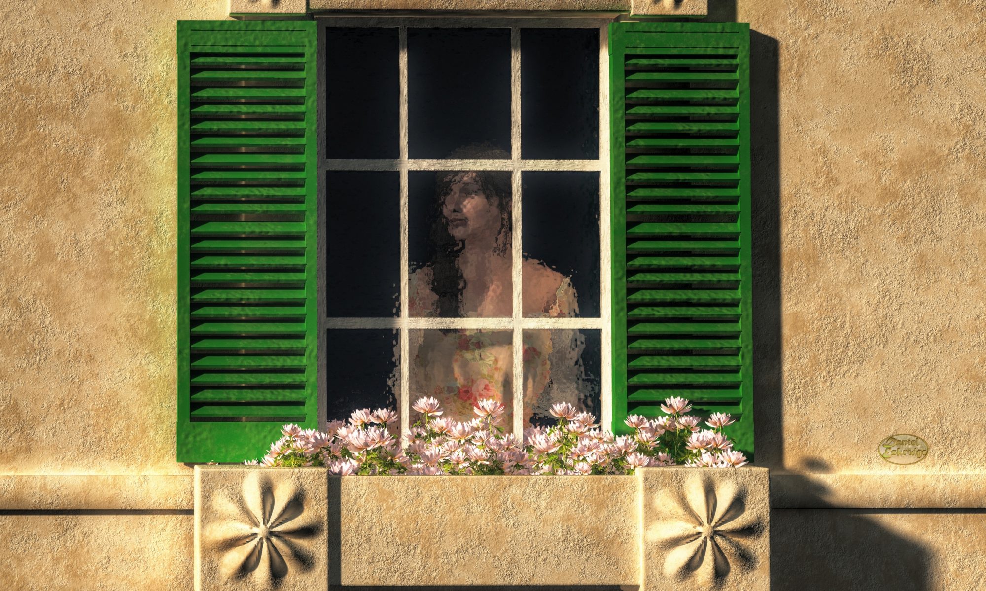
Light is the basis of human visual experience. For abstract work, it’s may not even be a factor, but for figurative work, it is possibly the most important of the fundamentals. The various ways of lighting a scene can immensely change the viewers experience. High key lighting gives a sense of lightheartedness, happiness, casualness. Whereas, low key lighting can give a sense of drama or danger. Strong back lighting can create a halo around a subject and is often used to indicate sensuality and love.
Texture
Texture is, of course, very important in the realm of sculpture. It’s the way something feels. However, it can, like lines and shapes, be implied visually. You can have texture in a 2D work by indicating to your viewer what a surface would feel like if they touched it, for instance, you might use a rough brush stroke to give a wooded structure a rustic feel.
Don’t underestimate this fundamental. One of the most popular selling items that I’ve seen are photographs that have been “textured” with the use of Photoshop filters.
______________________
There are other fundamentals as well. I just wanted to touch on the major ones. Understanding each of these and learning how to use them to your advantage will allow you to create works that have more of a psychological effect on your viewers. Used properly, they tend to give your work an air of professionalism, but moreover, viewers will just seem to like them more without knowing why. You don’t necessarily need to use all of the fundamentals in a given piece, and sometimes, they don’t even apply (like color in a B&W image), but even taking advantage of one or two can make your works more appealing to potential customers.
Regards,
Daniel
P.S.
Don’t forget to check out this week’s sponsor, BorrowLenses.com (since I offer this site for free, I have to fund it somehow 😉 )