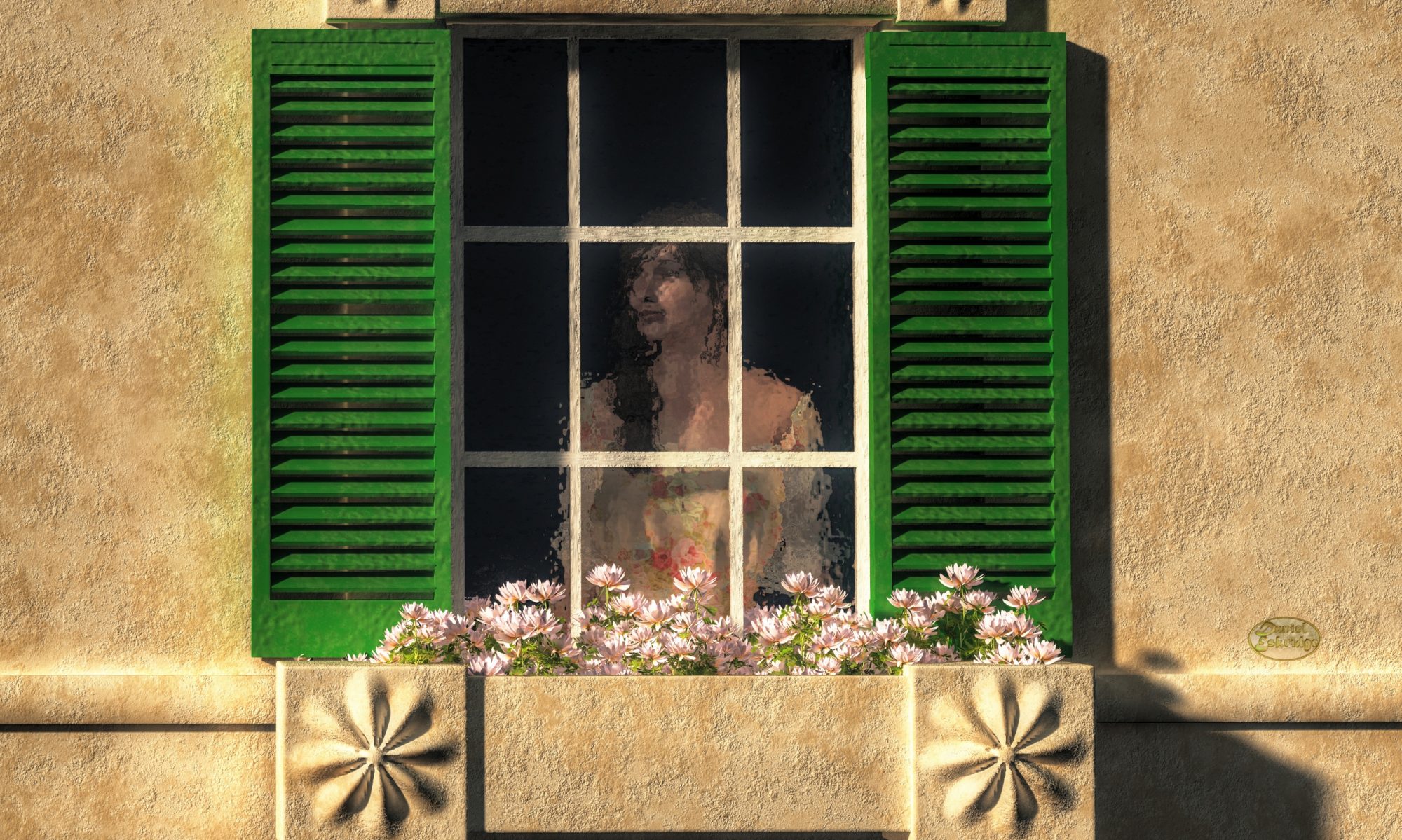
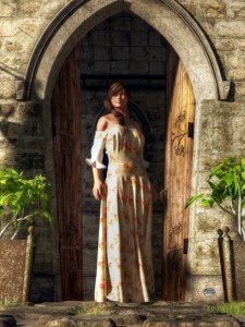
“Woman At A Medieval Door” In this work, I use the doorway to frame the figure of the woman.One of my favorite techniques for making art that captures an audience is framing. Framing is arranging your composition so that the main subject is partially or completely surrounded by something else in the scene: a window, the walls of a canyon, columns, tree trunks (one of my favorites)…anything that creates a psychological border that prevents the viewer’s eyes from escaping the image or moving away from the focal point. For instance, a common way use this technique is to position a person in an open door. In such an example, the doorway frames the human figure.
Generally, the elements that are being used to frame the subject are in the foreground, closer than or even with the subject being framed. In other words, the viewer is looking through the frame at the subject. The formal name for such a setup is repoussoir. However, you can use elements in the background to frame a subject, too. For instance, you might align your subject with a break in the clouds behind it so that the clouds create a halo around that subject.
Another thing that makes framing really neat is that it can give you as the artist power over the viewer. Using this technique, you can position the viewer within the scene. You can put them inside a house looking out, on a path leading into a forest, or outside of a cave looking in. In this way, you make them part of the art. You can even influence the viewer’s emotions with this technique. For instance, you can make them feel fear by boxing them in an alley, have them experience guilt by spying through a keyhole, or oppress them by trapping them behind bars.
So the next time you creating an artwork. Keep framing in mind. It can be quite a powerful tool.
Regards,
Daniel
P.S. If you liked this article, please consider signing up for my newsletter. I send it out every Wednesday and it includes links to my latest artworks, articles, and videos, as well as discounts, deals, and freebies!
A quick 10 minute video I put together on a tool I use to manage my art posts on Facebook and Twitter #hootsuite
Here’s the link I mention in the video http://www.introvertartist.com/hoot
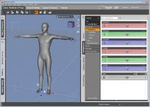
Almost all of my art includes characters of some sort. These characters are usually animals, creatures, or people, but also may include unique trees, skulls, dwellings, vehicles…anything that is meant to stand out in my images. Sometimes, I will sculpt a character from scratch using something like Scupltris, but often I will just use pre-existing characters, and for these, you really have two really good choices in tools to pose them:
Poser was the first on the scene to allow artists to pose virtual characters. Originally, it was intended to be used as a tool for artists needing pose references, but quickly it became a way of making art unto itself. Not only can you load and pose characters, you can also render completed scenes with it. That means it can simulate the effects of light and atmosphere and take a virtual snapshot of a scene with the posed characters.
I like it because it has a great interface that is easy to use and fast to pose characters. I also like that the native poser file format is compatible with Vue, the application that I use to build and render scenes. Also, Poser has a very powerful cloth simulator built in. A cloth simulator turns an object into virtual clothing recreating the effects of gravity and wind on an objects as it is draped over a character. Poser also has a few other features that I don’t use very often myself, but might still be useful to you including a hair and fur simulator, a feature that allows you to apply photographs of people’s faces to virtual characters, animation, limited sculpting capability, and a rather advanced material editor.
For a digital art tool, Poser is not very expensive. You can often get it on sale for less than $100. If you’d like to try it, you can check it out by clicking on the link below.
Daz StudioDaz Studio is the leading competitor to Poser. It can pose all of the same characters, plus a few more that Poser may not handle well. What’s really nice about it is that it is FREE! However, if you want to do some of the more fancy things with it, you need to purchase plug-ins. For instance, the cloth simulation will set you back $50 dollars.
I find the UI not nearly as fluid as Poser. Personally, I would not use Daz Studio if not for one thing: It has a plugin called LookAtMyHair which I have found to be the best system for adding fur to animals. With mammals being one of the primary subjects of my art, that’s rather important to me.
If you are interested in trying Daz Studio, click on the link below.
Where to Get Characters for Poser and DazStudio
There are lots of sites out there where you can get characters that will work in Poser and Daz Studio. The two I recommend are:
Daz3d.com – These are the same people who make Daz Studio (not surprising considering the name). They have perhaps the largest library of characters, but be careful, some may only work well in Daz Studio.
Renderosity – Renderosity started as a social network site for 3D artists, but they have a great store too. They don’t have as many characters as Daz3d, but they have tons of things to add on to characters such as clothes and hair. Their prices tend to be a little better, too.
_____________________________________
If you want to get started in 3D art, either Poser or Daz Studio is a great tool to look into, but be careful, you might easily become obsessed with making 3D art 🙂
Regards,
Daniel
P.S. If you liked this article, please consider signing up for my newsletter. I send it out every Wednesday and it includes links to my latest artworks, articles, and videos, as well as discounts, deals, and freebies!
P.P.S.
By the way, the links to other sites in this article are affiliate links. If you click on them and should happen to buy glow within the next few weeks, I will get a small commission on the sale. It does not raise the price for you. For those of you who do buy, THANK YOU!
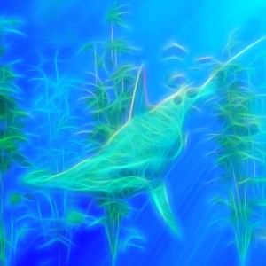
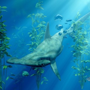
My “Hammerhead” image AFTER processing with GlowA hammerhead shark swims beneath the sea in this impressionist work featuring fluid glowing lines with an almost neon quality to them.
This was actually made from an older image of mine that was a realistic image of a hammerhead shark, created using digital 3D rendering techniques. I’ve altered it though using a tool called Glow From Topaz labs. It’s a really cool computer program that gives your images a wild expressionist look ranging from a style reminiscent of Vincent Van Gogh to modernist neon impressionism.
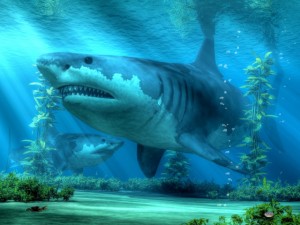
My “Hammerhead” image before processing in GlowI’d seen a lot of photographers making sales with their photos that had been run through Topaz Glow. They looked awesome and I knew I wanted to give the application a try with some of my render art. It required me to update the drivers on my graphics card, but once I did that, it was easy to install and very easy to use.
I found that it doesn’t always make an image better, but for some it really had some great results. This particular image, I thought, turned out very well.
If you’d like to check out Topaz Glow, and I recommend that you do, you can click on this link:
By the way, that link is an affiliate link. If you click on it and should happen to buy glow within 30 days, I will get a small commission on the sale. It does not raise the price for you. For those of you who do buy, THANK YOU!
Regards,
Daniel
P.S. If you liked this article, please consider signing up for my newsletter. I send it out every Wednesday and it includes links to my latest artworks, articles, and videos, as well as discounts, deals, and freebies!
I recently did a video review of the art program Impression from Topaz. It’s a great tool for adding style to your digital photos and art. Check it out.
Hey, everybody, I’ve got a really cool product to tell you about today.
It’s called Topaz Impression, and it’s a really great way of adding some unique styling to your photos and your digital art.
It should take me about eight minutes, and it should be pretty quick.
So without further ado, let’s get started.
Alright, so here I’ve loaded Topaz Impression.
As you can see, it starts with an image.
This is the default that comes with the application.
We’re not going to use this today.
I’m going to use one of my own images.
Now, typically you’d load a photograph in this, but, since I’m not a photographer, I’m just going to load up one of my artworks.
And, to load up something, you just go to the top menu here, select “open”, and find your file.
I’m going to use my “Iguana Coffee” image.
You can see here: it loads the image and then it starts to immediately apply…I think this first preset up here…which is “Charcoal 1”.
We’ll get to the presets in just a minute, though.
…couple of things to show you first
You have different ways of viewing you enhanced version and the original side by side, or top and bottom.
This is a kind of a neat little feature here where you can sort of see how much it’s changed, how much Topaz has changed it.
Here’s side by side full versions and top and bottom full versions.
I’m just going to go the the filtered version thoough.
This is just a quick zoom feature.
And, this is just another way of viewing that zoom.
And then, you can also just snap to the original.
Let’s turn the original off, and zoom to this level.
Down here at the bottom, I beleive this is the strength of the filter
Right, So, this is how much the filter is applied to your original image, and there’s various blend modes here to change the way that you…that the two are mixed together.
So you can say…multiply…screen…some fun things to play with.
And now over here, on the right hand side you have presets.
Let’s go back to normal blend mode and 100% strength.
And this is really just a starting point for whatever filter you want to use.
And they also have sets of these presets.
So, we’ll go with the “Ancient” preset.
Here’s some interesting looking ones…go with “Cracked Fresco”.
That’s kind of interesting, but I don’t think I like that one.
Let’s try “Cave Dweller”.
That one’s really wild!
Anyway, we can…once you’ve kind of picked a preset that you like…
Let’s try impressionistic…and, “Monet 1”
It looks kind of painting like.
Anyway, once you’ve picked a preset you like, you can click on this set up here, and this will take you to the individual parameters for your…for your image.
You can pick like your brush style…pick maybe a finer brush…the size of that brush…a whole bunch of other things.
I’m not going to show you all of them for time’s sake.
But, it’s a lot of fun to just figure out what works for you.
Let’s see…whoa!…That’s a little bit too extreme there.
Alright…stroke length…
Well, you get it to pretty much where you like it, and then…a few other things to cover.
You have down here the color section.
This is the same kind of color adjustments you can make in any program, such as GIMP or Photoshop…you can do them here as well.
You can change the hue and the saturation as well as the lightness…contrast.
This vignette thing here sort of gives it a spotlight type effect.
Let’s turn it way up here so you can kinda see it.
So…as if you are looking at it under a concetrated light.
Light Direction I think applies to this texture stuff down here.
Now, texture is what you do to kind of…give the image a look like as if it was painted on a canvas.
I like this “canvas 3” here.
You can’t really see it here just yet until I turn the strength up.
Turn it WAY up…and, reduce the size a little bit.
And now this really looks like it was painted on a canvas…I mean…this would fool a lot of people.
Now, my signature down here has been kind of destroyed, but the rest of the image is looking pretty good.
When you get to a point that you like, you can…save the presets. So you can apply this to other images of yours.
And this is kind of, would, is a way of working towards a consistent style.
So you just click the “plus” button up here and the pick a place to save it and then give it a name…call it “MyImpression2” on this one.
And now, that should be saved.
I’m not going to go back an look at it now.
When your ready, though, you can save your image by clicking on the “Save As” button down here, and…I’ve save this one before as…you gotta be careful when it…the first time you try to save it, this is what I got and it was the original name of the file, and it would overwrite the original file,
and I don’t want to do that.
Okay, and now I can go to my desktop and have a look at the file.
Okay, so here’s the original…and then here is the enhanced version.
You can see it’s definitely got a much more painterly look to it.
So, I’ve experimented with this a little bit with a few of my images,
and here I have one that I uploaded last September of a…Beachcraft Staggerwing.
And…um…I actually sold a print of this within just a few weeks, and…won a few contests as well.
So, it’s sucessful!
I mean, I’m probably not gonna…probably not gonna use this for most of my images, but it’s sort of a…an interesting thing to do every once in a while.
So, if you…wanna try Topaz Impression…in the description of this video, there will be a link to the Topaz site.
Or, if you want, you can…I have a forwarded link…in a…from my blog: go to www.introvertartist.com/impression, and it will take you to the site.
And from here you can buy it!
Now, in a…for a…in all honesty that is a…an affiliate link, so I will get a small commission if you do happen to buy Topaz Impression within the first thirty days of visiting the site.
So if you liked this video and you’d like to see more, ore read my articles, or even see some of my latest art, you can always follow me on Facebook at www.Facebook.com/TheArtOfDanielEskridge
So, thanks, everybody, and goodnight!
Probably the best way to make money online with your art is to sell prints using Print-On-Demand (POD) sites. If you want to know more about How I use a POD site to sell art, jump over to my new website and checkout this page: How I Sell Art.
That said, the most important thing you can do to have a healthy gallery on a POD site is to upload high quality digital images of your artwork. So without further ado, here are a few things I’ve learned about uploading your art to sites like FAA:
Do Use Big Images
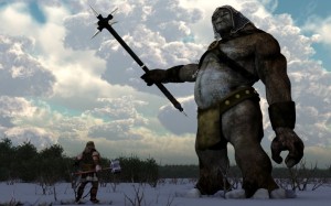
For my work “The Biggest Shark” I used the biggest image I’ve ever produced at over 50 megapixels.
The higher the resolution of your image, the larger the print that can be made from it. So if you upload a 600×800 pixel image, your customers will not have much choice in the sizes of the prints they can order. They’ll be stuck with some very small options. I generally upload only images that are 3000×4000 (that’s 12 megapixels) or higher, but you can probably go as low as an 8 megapixel image and still provide a wide range of print sizes for your buyers.
Don’t Upsize You Image
Though you should use big images, NEVER enlarge a small image using something like Photoshop or GIMP. Enlarging a digital image lowers it’s quality, creating pixelation that will be visible as “patches” in the print. If someone orders such a print, the POD service might refuse to complete the order. They don’t want to risk the loss associated with a return. Not only is the sale cancelled, but the customer is left frustrated and will likely not return.
Do Enhance Your Image
For, “A One Sided Conversation” I used Topaz Impression to enhance the image to look like an Impressionist painting.
If your image was not digital art to begin with, take the opportunity to enhance it. If you used a digital camera to digitize your work, you may HAVE to do this to compensate for less than perfect lighting conditions at the time you took the picture. You can use software tools to do things like:
Now, if you are trying to sell the original through your POD site along with prints, you probably don’t want to make the digital version diverge too much from the original. After all, you don’t want to misrepresent your original. Otherwise, you can enhance to your hearts content. In fact, you might even try using the same source image and applying different sets of enhancements to different copies to turn one work of art into many.
Don’t Overcompress
Many PODs have a file size limit, and, in order to come in under that limit, you will probably have to use some form of compression to on your image. The most common form of image compression is JPEG. When you use software to compress an image, such as GIMP or Photoshop, they will offer a list of compression algorithms. PNG is better, so use it if you can, but often, the files that it produces will still be too large, and in some cases, it’s irrelevant because the POD site converts all uploads to JPEG anyway. So, if you use JPEG (JPG), you will usually be given the option to set the quality of the compression as a percentage. Go for the highest percentage you can to avoid a banded look in parts of your image where there are large areas of similar color. If you compress too much, the image quality might fall below the threshold of what the POD will print.
Sometimes, I will actually reduce the size of an image rather than use a low JPEG quality level to get an image under the max file size for FAA. Unlike upsizing an image, downsizing does not lower the quality nearly as much.
Do Create A Low Resolution Version For Marketing
Once you have your digital image ready to upload to a POD site, create a small copy of it, something that is only a couple of megapixels. Use this smaller copy when you upload your image to anywhere other than your POD site. So if you are marketing your work on any social networks, such as Facebook and Twitter, or photo sharing sites, such as Flickr and Tumblr, use the low resolution image. First off, it will be quicker to upload, but also, it will deter any serious art thieves. With only a low resolution image, no one can take your image and reupload it as theirs to another POD site and compete against you with your own image. Also, make sure the POD site does not make your full resolution image publicly available.
________________________
These are some of the important tips I’ve picked up over the years using POD sites. I’ve always been surprised at how many artists I see on forums complaining that their sale was cancelled due to poor image quality. I know it would certainly ruin my day to see one of my sales reversed. So make sure it does not happen to you. Upload quality digital images to your POD account.
Thanks everybody!
Daniel
P.S. If you liked this article, please consider signing up for my newsletter. I send it out every Wednesday and it includes links to my latest artworks, articles, and videos, as well as discounts, deals, and freebies!
* Please be aware that my link to Topaz Impression is an affiliate link. Should you click through that link and order anything from Topaz withing the next 30 days, I get a small commission. This happens at no additional cost to you. And, THANK YOU in advance if you to do order.
In this video I introduce you one of my favorite digital sculpting applications. Not only is Sculptris easy to use, but it is remarkably powerful. Plus, it is FREE!
Sometimes I don’t like the texture that comes with a Poser (or Daz Studio) figure. So I re-texture it using ZBrush. I thought that other 3D render artists might benefit from knowing how I do it, so I posted a tutorial on Youtube.
So…here’s the video:
Daniel
P.S.
Don’t forget to check out this week’s sponsor, Dick Blick Art Materials (since I offer this site for free, I have to fund it somehow 😉 )
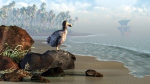
“Dodo Afternoon” One of my best selling prints on FAA.
Generally people like to save the best for last, but I’m going to go with the best first. Building up the infrastructure to sell art online requires time. When you post artwork for sale, it can take months for search engines to pick up your entry. So I’m going to tell you about my favorite Print-On-Demand site first, because, the sooner your get started, the better.
As I’ve mentioned before, Print-On-Demand (abbreviated “POD”) sites are websites that display your artwork on the web, and, from which, people can purchase prints. A print of your art is not made until someone places and order. The POD site handles accepting the payment, making the print, shipping it and handling any returns. The website gets part of the profit from the sale and your get the rest.
There are dozens of POD sites on the web. So which is the POD site that I prefer, the site where I keep all of my art that I sell as prints? It’s FineArtAmerica.com (abbreviated by most people as FAA).
If you’d like to know more about how I used FineArtAmerica to sell my artwork, check out my article How I Sell art on my art site.
FineArtAmerica.com has recently been transitioning to the name Pixels.com, so visitors can go to either site and your works will appear on both (There is one subtle difference between the two: pixels offers phone cases featuring your art in addition to prints).
FineArtAmerica: Pros
There are quite a lot of features I like about FAA…too many to list in this article, so I’m only going to cover the top ones.
Fixed Mark-Ups
In my experience, the biggest benefit that FAA offers is mark-ups. On FAA you specify your commission for a print sale as a dollar amount…you set a mark-up for each print size. Conversely, almost every other POD site has you specify your commission as a percentage of the total sale, which makes it hard for you to know how much you will get for a sale and sometimes (depending on how they do their math) can make your works much more expensive than they would be on FAA for the same commission amount. In fact, the owner of FAA, has an article that includes this very subject.
Sized to Fit Prints
One of the things that drives me nuts about most POD sites, it that they only sell particular sizes of prints. These are usually the standard sizes such as 11″x14″, 16″x20″, 18″x24″, etc. The problem with this is that your artwork’s aspect ratio can’t fit all those sizes, and, in fact, may fit none of them at all. To deal with this, those sites force your work to be cropped to fit their offered sizes. Not so, with FAA. On FAA, the selections are based on the length of the longer side of your art. The shorter side is automatically adjusted to fit your whole image, meaning that no cropping is necessary.
Artist Website
For users who pay the annual fee ($30 U.S.), FAA automatically creates a website just for you. You can even have your own domain name (like DanielEskridge.com) redirected to this site. Your artist website requires no additional work on your part; though, if you want to, you can customize it to some degree. One of the great things about this site, is that visitors see only your work and none of the work of other artists on FAA. For instace, if visitors do a search on your artist website, only your works show up in the results.
Licensing
If you’re an illustrator like me, there is a licensing program that allows people interested in using your art for their commercial endeavors to purchase non-exclusive license agreements. FAA handles the contract, fee collection, and the delivery of the high resolution file. All you have to do is watch the fee get credited to your account! Note that they do add a 30% mark-up on top of your fee.
Other Great Features
Here’s a few other great features:
You can sell originals on FAA
FAA has a mechanism for you to manage an email marketing campaign
FAA allows you to generate discount codes and have limited promotions
FAA has social aspects such as user organized Contests and Groups
FineArtAmerica: Cons
FAA is not perfect. Here are a few cons that I can think of…
The Fee
A lot of POD sites are free to use. FAA does have a free option, however you are limited to 25 works for sale and you miss out on a lot of features, like the artist website. The fee could be worse though as it is only $30 (U.S.) a year.
Preferential Treatment
The internal search engine, collection galleries, and featured images all favor artists whose prints sell better. If you are new to FAA, this works against you a bit as the established artists have the advantage. However, keep in mind that the folks at FAA report that most sales come from buyers who found the art via a Google search, not from internal browsing and searching.
Upload size limit
Any image you upload to FAA must be under 25 megabytes. For a large high quality JPEG, that is easy to pass. I often finding myself having the lower the compression quality of my images to fall under that limit.
Print Rejection
For digital artists like myself, this isn’t much of a problem, but photographers and traditional artists may get hit with this. Whenever a print is ordered from FAA, someone checks the quality of the image and might reject if it falls below a certain standard. Generally, they look for things like blurriness, pixelation, visible edges – like the side of the canvas that the painting is on, etc, i.e. technical flaws. The problem is you don’t get this rejection until someone orders a print. That means that not only does the artist miss out on a commission, but the buyer might be driven away. In some cases, it is understandable, as the images really are of poor quality, but I’ve often seen artists complain of an image being rejected that was really not that bad or only appeared to have problems due to the artists particular style.
____________________
There is a lot to FAA. If you are looking for a good POD site, I strongly suggest you check it out.
If you intend to sell prints using POD services, or if you are creating digital art that will be printed for some reason or another, such as book cover illustrations, then this is something you will likely have to deal with. I get it from time to time, especially when doing illustration contracts. A person from the print shop or publisher will tell me that my image has too low of a DPI and that they can’t print it. This person does not know what they are talking about. Now it could be that that what they mean is that the image’s resolution is too low, but, for my images, which are usually in the 40 Megapixel range, such is not the case. Most of the time they are just ignorant of what DPI really means when it comes to a digital image file.
DPI
It’s the size that matters!The subject of DPI comes up quite a bit when you deal with digital art. DPI stands for “Dots Per Inch”. People who deal with printed media seem to think it is an important number. Indeed, when you actually print something, it can be somewhat important. An image printed at 300 dpi looks great to the human eye from just several centimeters away; at 50 dpi through, it would look pretty grainy close up. However, when it comes to digital art in its digital form, that is, as an image file on the computer and not printed out, it is almost completely irrelevant. In fact, it is actually less relevant even when printed than some might have you believe.
DPI has virtually no relevance for a digital file. It is just a number in the metadata (known as the EXIF data) of an image file that suggests to a printer how dense to print that image. That suggestion can easily be (and usually is) overridden when a print is made. For instance, if I have an image file where the EXIF data states 300 for the dpi and the image is 3000×3000 pixels, the bitmap data is exactly the same as a 100dpi version of the same image that is also 3000×3000 pixels. The only difference is that if you print them both without specifying a print size then the 300 dpi one will print a 10″ x 10″ print and the 100 dpi would give you a 30″x 30″ print. Now, if you took the 100 dpi and told the printer to give you a 10″x10″ print it would actually give you a 300dpi print thas is ten inches on each side, i.e. you’d be overriding the default dpi.
In other words, resolution is what matters. An image with a high resolution can print a larger, higher quality image than one that has a low resolution. When it comes to digital art, the number of megapixels is what is important, not dpi. That is one of the reasons I create all of my art at at least twelve megapixels and quite often as much as sixty. That size gives lots of printing options.
Not only is DPI irrelevant to digital files, is also overrated when it comes to printed material. It is true that the higher the dpi, the higher the quality of the print. Print shops often insist that 300 dpi is the gold standard and that all images be printed at that or a higher resolution. 300 dpi does indeed look great from even a few centimeters away, but how often do you really look so close at a piece of wall art that your nose is nearly touching it? Probably not often. Most people look at wall art from a few meters away. At that distance, a 300dpi and a 100dpi print of the same image at the same physical dimensions would look identical. If you don’t believe me, get a close up look at a billboard image one day. From arm’s distance, you’d see nothing but a bunch of colored dots. Billboards are printed at around thirty dpi.
PPI
Some people might tell you that DPI is not important for an image but that PPI is. They don’t know what they are talking about either. PPI stands for Pixels-Per-Inch. It applies to monitors not files. For a digital image file, this is meaningless. Where is does come into play is when an image is displayed monitor. A monitor with a high PPI will show images smaller but with higher quality, but, again, for the image itself, the resolution does not change. It’s the monitor that determines the PPI, not the image.
______________________
I hope that clears a few things up for some!
Daniel
P.S.
Don’t forget to check out this week’s sponsor, Dick Blick Art Materials (since I offer this site for free, I have to fund it somehow 😉 )