In this video, I show you how I create a fantasy scene depicting an elf standing with a deer in a dense forest. Starting with Poser, I pose the V4 model and use the cloth room to do a couple of cloth simulations for her dress, then, also in poser, I add the deer. I’ll show you how to transfer poser characters to Vue. Then, in Vue, I construct a forest scene around the Poser Models. Finally, towards the end, I show you how to use GIMP to do a bit of post production work.
In this video, I show you how to rig a complex model using a Blender 3D armature to create and underlying skeleton of bones that you can use to pose 3D character models. I also show you how to use Blender’s weight paint mode to tweak the rigging so that all the parts of the model correctly move with the rig.
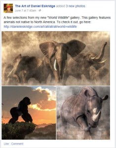
Here is a recent multi-image post that I made on my Facebook fan page
I find that being an artist is about more than just making art, it’s also about getting people to see your art. To that end, I’ve found my Facebook fan page to be one of my most useful resources for publicizing my images. Occasionally, I use the basic image post to show off my latest works, which is nice in that the image appears forever after in my fan pages’s photo album. More often however, I use link shares, which are superior at bringing visitors to my gallery site.
Sometimes, however, I want to do something that draws my fan’s eyes a bit more. After all, Facebook users see image and link posts flooding their streams all the time. For that, I’ve found that a third method of posting images exists: the multi-image post.
Multi-Image Facebook Posts Defined
The multi image Facebook post is simply a post containing more than one image. Facebook is smart enough to size the images based on the number of them in the post to make them fit. If you post two, they appear one over the other. If you post three or four, you get one image on top larger than the others. If you post more than four images, only the first four will appear, but the fourth will be darkened and have “+#” appearing over it indicating how many more images are in the set.
The post can include a text section that appears above the pictures. Also, all of the images will appear in your fan page’s photo album after you’ve posted the status update.
How to Do a Multi-Image Facebook Post
There are several ways to do a multi-image post:
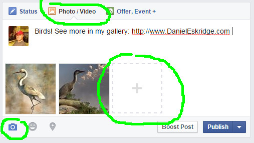
If you’ve already started a basic image upload, you can just click on the square with a plus sign in it to add more photos. If you want to control the order in which your images appear in the post, I suggest this method.
You can select the photo/video tab from the status update section, click “Upload Photos/Video”, then ctrl+click on more than one image from your hard drive.
If you’ve already started typing a status update, you can click on the camera icon underneath, then ctrl+click on more than one image from your hard drive.
You also can include text with links as part of the post. Once you’ve actually posted the set, you have one more step to take: you need to click on each image and give it a description (and preferably a link back to that image’s page on your FineArtAmerica gallery or other website).
Effectiveness of the Multi-Image Facebook Post
So now the big question: how is the multi-image post useful? Well…I’ve found that it does seem get a bit more attention than the other forms of image posts.
To start with, it simply shows up bigger in peoples stream’s. Also, a cluster of images also seems to draw attention more than a single one.
However, though I get more comments and “likes” on these kinds of posts, I get virtually no one clicking through to my print gallery. As a result, I only occasionally use multi-image posts to spice things up. That’s not to say you may get different results. Either way, it’s a good tool to know about.
Regards,
Daniel
P.S. If you liked this article, please consider signing up for my newsletter. I send it out every Wednesday and it includes links to my latest artworks, articles, and videos, as well as discounts, deals, and freebies!
In this video, I show you how to create your own grass species in Vue. It a somewhat advanced skill, but it can be very useful, especially when applied to creating ecosystems.
In this video I show you how I create an aquatic scene depicting a sperm whale. Starting with sculptris, I sculpt and paint the whale model. In Blender3D, I rig and pose that model, and in Vue I construct an underwater scene featuring the whale model. At the end, I show you how you can upload art to FineArtAmerica and make it available for sale.
In this video, I show you how to use install Topaz Adjust (which is a Photoshop plugin) into GIMP and how to use it to enhance the colors of your digital photos and digital art.
In this video, I show you how to use Install Topaz Adjust (which is a Photoshop plugin) into GIMP and how to use it to enhance the colors of your digital photos and digital art.
This one is for my fellow render artists out there. Anne Marie Rasmussen, editor of Dog Gone Art Magazine has recently published a new book that introduces folks to Daz Studio. I am eagerly awaiting my copy and I’ll hopefully have more to tell you about it soon. In the meantime, pop over and check out her blog where, in addition to selling her book, she also reviews products for use in Daz Studio.
In this video, I take you from start to finish on how I created my artwork “Hunting Dog by a River” using a variety of digital 3D rendering and painting techniques. Not only do I show you how I made it, but also, I touch on how I sell and market such art online.
In this lesson/tutorial I’ll cover some of the following topics:
Creating a shoreline in Vue
Posing a dog figure in Poser and transferring it to Vue
Using a Vue Z depth map for post production in GIMP
Fixing fur using a GIMP brush.
Uploading artwork to FineArtAmerica.com
Marketing art from FineArtAmerica on Facebook, Twitter, Pinterest, and Google+
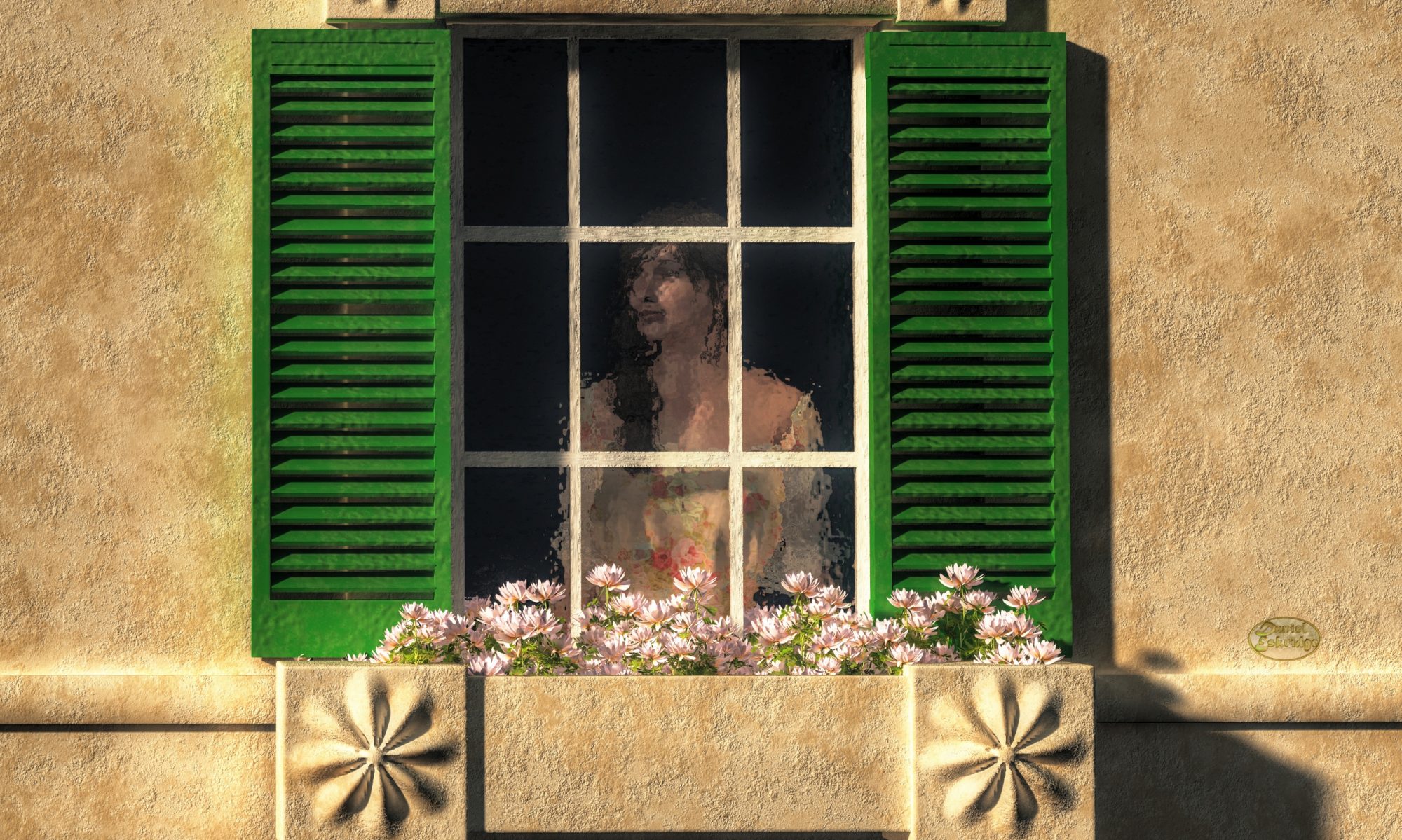
Do you want to know a neat way to influence the minds of your audience? Do you want to create art that affects the people looking at so that it makes them happy, or feel sad, or awestruck. Of course there are many ways to affect the psychology of your viewers, but one particularly subtle method and the subject of my article today is the view angle.
What is the View Angle?
The view angle goes by a few names. In photography and cinematography, it is generally called “camera angle”. It drawing and painting, you might hear it as the “point-of-view”, “perspective”, or “horizon line”. Basically, it defines how the viewer looks into the scene. Are they looking down at the subject, up at it, or level with it? Of course for purely abstract work, this doesn’t apply, but for most scenes you can use this to indicate the emotion that the viewer should experience when seeing it.
High Angle
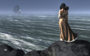
“The Leaving” In this image, I used a high angle to give the woman a sense of sadness as the ship sails away. The horizon being high in the composition also increases the sense of distance between the woman and the ship.For a high angle scene, the viewer is looking down upon the subject. It may only be a subtle downward tilt, but it could be looking almost straight down at something. In the composition, the horizon line (or perceived horizon) is more than half way up the picture and, in fact, can be off above the top of the frame. The front sides of objects in the scene tend to have curves and angles that point or motion downwards.
The psychological effect of this point of view is generally one that elicits darker feelings in the viewer: depression, sadness, loss. Because this angle indicates that the viewer is above the subject, it also gives them a slight sense of superiority even possibly allowing you to elicit sympathy from your audience. For instance, images depicting the death of a hero, innocent, victim, or any other type of character that the audience should like tend to use this angle of view.
The high angle of view can also increase the sense of time in a scene. In outdoor scenes, the eye has to travel further from the bottom to reach the horizon. In other words, the sense of distance in a scene is increased. Also, viewers tend to perceive objects intended to be in motion as heavier and moving more slowly.
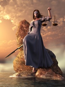
Low Angle
“Blind Justice With Scales And Sword” In this image, I wanted to make Themis, the embodyment of justice, seem heroic. So I depicted her from a low angle.The low angle scene is one where the viewer is looking more up at a subject and gives the opposite effect from the high angle point of view. With respect to the compositiuon, the horizon is below the halfway point in the image. The front edges of object have angles and curves that motion towards the top of the composition.
Low angle scenes tend to be happier in theme. In outdoor scenes, the sky dominates and introduces a great deal more light into the image. As the angle increases, subjects can start to give off a heroic sense even awe. The viewer tends to be inferior to the subject. This psychological effect is one of the reasons why kings and rulers sat on elevated platforms throughout history. Taken to the extreme though, you can give your viewers a sense of fear as a subject looms over theme.
Also, from this point of view, objects meant to be in motion tend to appear to be moving faster, and they might be perceived to be lighter in weight.
The Dutch Angle
The Dutch Angle, or the dutch tilt, is a more unique angle. It is accomplished by tilting the scene. In the real world, we don’t tend to experience it as our brain compensates for any tilt of the head, but in art, you notice it because the tilt conflicts with the level lines of the top and bottom of the frame. In a way, the Dutch angle sort of combines both the low and high angle. The horizon now travels diagonally across the scene. The effect on the viewer is to instill a sense of unease and unbalance. This is a favorite of horror scenes, but can also be used to make an action scene feel more chaotic.
You should be careful of using the Dutch angle too much. Viewers sometimes catch it as an attempt to manipulate them, and that destroys the intended effect. For instance, I’ve seen lots of movie reviews poking fun of director Michael Bay for overusing it in his action movies. Instead of instilling a sense of unease, the it creates unintentional comedy.
Being aware of and using the view angle in your art is definitely something you should look into as an artist. However, keep in mind that the contribution of view angle to an artwork is generally not that extreme. Its effect is subtle, and it is something probably better used in combination with other visual cues to influence your audience, such as framing and lighting. However, I find it to be another useful tool to consider when putting a scene together.
Regards,
Daniel
P.S. If you liked this article, please consider signing up for my newsletter. I send it out every Wednesday and it includes links to my latest artworks, articles, and videos, as well as discounts, deals, and freebies!
Here’s tip for you artists out there. Look into Outlook.com. I use it extensively. You may already have tools for doing similar things, but, if you don’t, it’s something you may want to check out.
What is Outlook.com
It’s is a website run by Microsoft that gives access to a number of tools and services that I find indispensable for my online art business. Most of what is has to offer can be found elsewhere, for instance, Google offers similar services, but I find that Outlook.com just seems to do things more smoothly. Oh yeah…it’s free (up to 15 Gigabytes).
What does Outlook.com offer
Here’s a quick list of what it includes:
An Email Account
A place to store contacts
A calendar
Cloud file storage (OneDrive)
Word processing (Word)
Spreadsheets (Excel)
Slideshow presentations (Powerpoint)
OneNote
Office Online
Now, I don’t use all of these service but a do use some of them. I use the email to act as the source of my email marketing campaign; and, for writing commission contracts and license agreements, I use the online Word feature; but, for me, the most useful feature is OneDrive. I use OneDrive for transferring high resolution images that are too big for email to licensees, publishers, and anyone else who needs a digital version of a work. I also use it to share wallpapers to my newsletter recipients.
Why I Prefer Outlook.com
There are a couple of reasons why I think Outlook.com is better than the competing services:
When I first started my email campaign, I used my trusty old Yahoo address. The problem was that none of my emails appeared to generate any sales or traffic to my site. It turns out that any emails sent from an email campaign management service with a Yahoo address automatically are destroyed without notification by mail servers. Apparently, there are some other email providers that have this same problem.
Outlook.com does not have this problem through. Once I started using it as my email campaign source, I started getting results.
OneDrive Shares Files Unconditionally
I used to try and share files using Google Drive. The problem was that Google Drive required recipients to have a Google account of their own. Many of my clients are not that computer saavy and did not want to have to register for yet another online account just to receive the illustration I had made for them. Thankfully, OneDrive allows me to generate a link to share a file and anyone with that link can get it.
I hear that Google has since changed their policy, but, for me, the damage is already done. I’m used to sharing files the OneDrive way.
If you are not using Outlook.com, I suggest checking it out. It can be really useful stuff, and it won’t cost you anything to get started. Google offers similar services and I’m sure there are a few others, but for some reason, I just find that I like Outlook.com best.
Yes, I know this whole article sounds a bit like a paid ad, but it isn’t. It’s just a service I really like and wanted to share.
Regards,
Daniel
P.S. If you liked this article, please consider signing up for my newsletter. I send it out every Wednesday and it includes links to my latest artworks, articles, and videos, as well as discounts, deals, and freebies!